Ink + Shirt Color Combinations that Always Work
Ink + Shirt Color Combinations that Always Work
Design, Guides
Feeling overwhelmed trying to think of what ink color combination to choose for your next t-shirt design? Or maybe you know the apparel colors you want to print on, but can’t think of what ink colors will print well on them. While the easy go-to option is black or white ink, there’s so much to be explored with choosing more colorful inks. We’ve pulled together a list of some of our favorite t-shirt and ink color combinations that work every time!
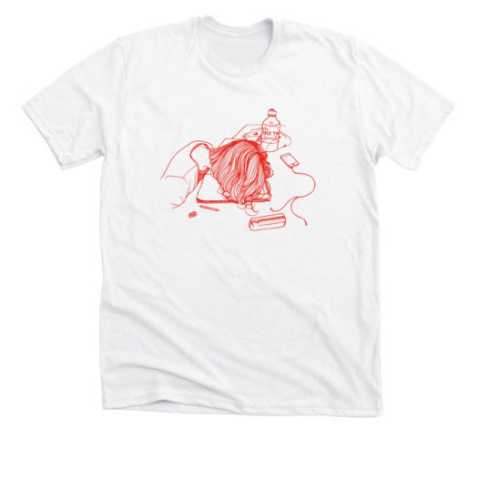
Red + White
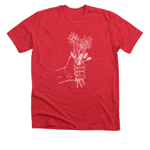
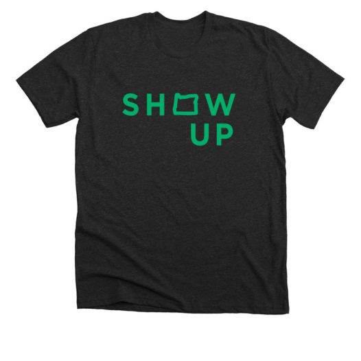
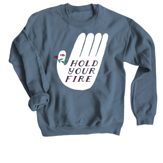
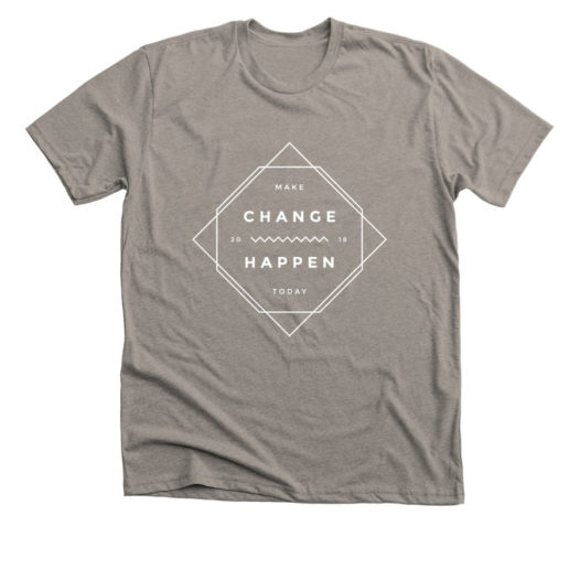
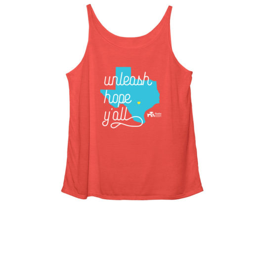
This combination is a great choice to make a design really pop. Delicate linework shows up best when there’s a strong contrast between the ink color and the color of the t-shirt fabric. So any bright color ink printed on white apparel, or white ink printed on a dark shirt color will always look sharp.
Green + Gray
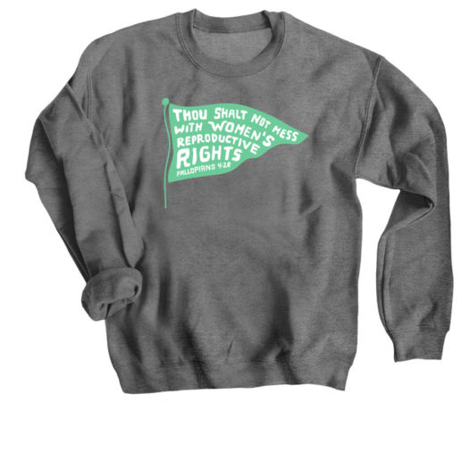
There’s just something about Green Ink on Gray clothing. Whether your green is more earthy or leaning toward Kelly Green or Teal, it’s bound to look awesome on our Gray apparel options. Bonfire team favorite is Kelly Green on our light or dark grey Crewneck Sweatshirts.
Blue + White
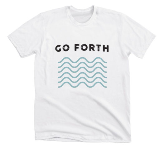
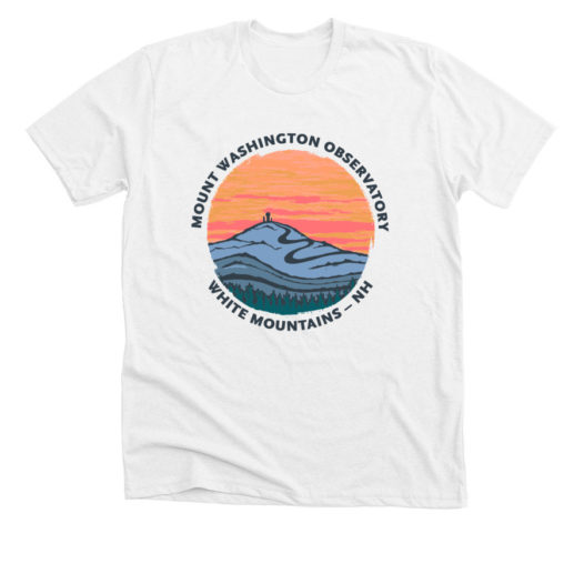
Blue is a calming and neutral color. Combining Blue with white works well, whether you’re designing a shirt with a water theme, or looking for a calming color palette.
Ready to design your custom shirt?
Find some inspiration for your shirt with our free design templates
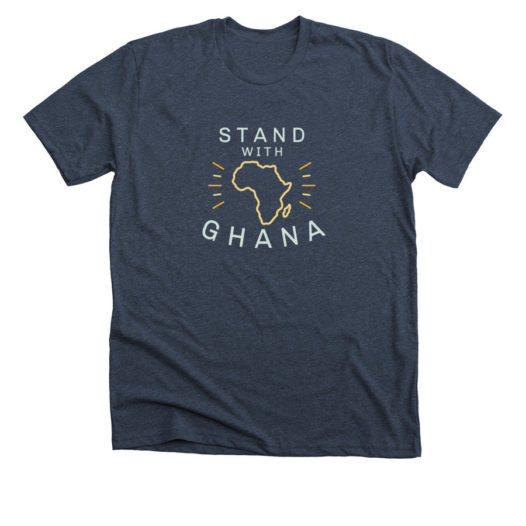
Blue + Yellow
There’s something about combining these two primary colors that just works. The warmth of yellow tones meets with the cooling effect of blue tones to create a neutral design balance. To add complexity, use a few shades of yellow and blue to really explore that complementary relationship even more.
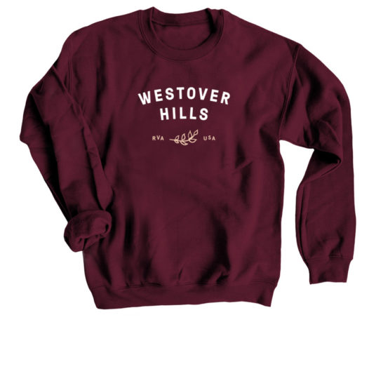
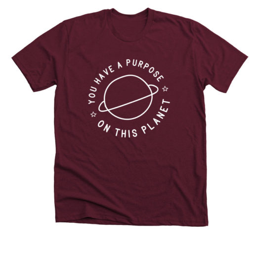
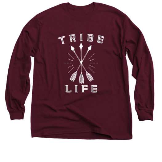
Maroon + White
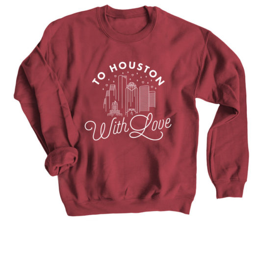
These colors pair so well together because of the high contrast between the colors. Maroon shirts allow white designs to really pop, which is especially helpful when a design has delicate and thin lines. Bonfire’s Maroon Crewneck Sweatshirt is a wonderful apparel item to print on to achieve this look.
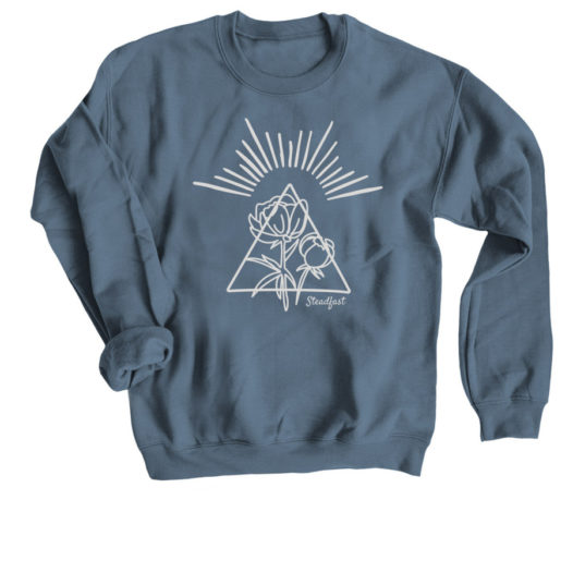
Blue + Grey
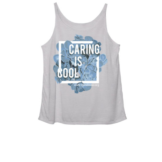
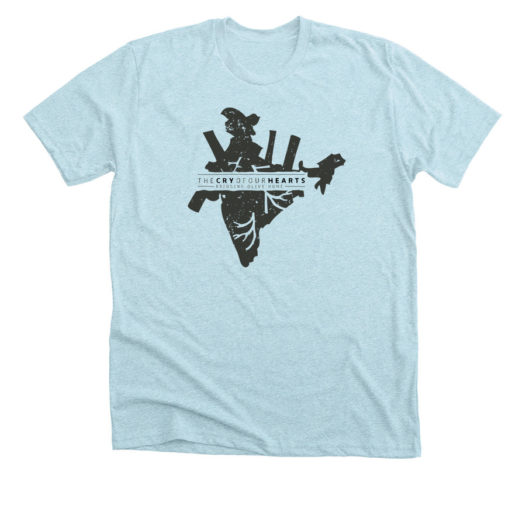
Combine blues and greys to create a shirt that feels cool in tone. Because there are so many colors in the realm of blues and greys, and because we have so many types of blue and grey shirt colors to choose from, your possibilities are endless for this color combination.
Red + White + Blue
While on paper this color combination sounds limited to patriotic designs and flags, in practice it ends up working out really well for all sorts of designs. The primary colors of red and blue balance out well with the neutrality of white.
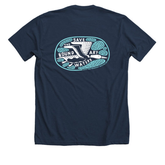
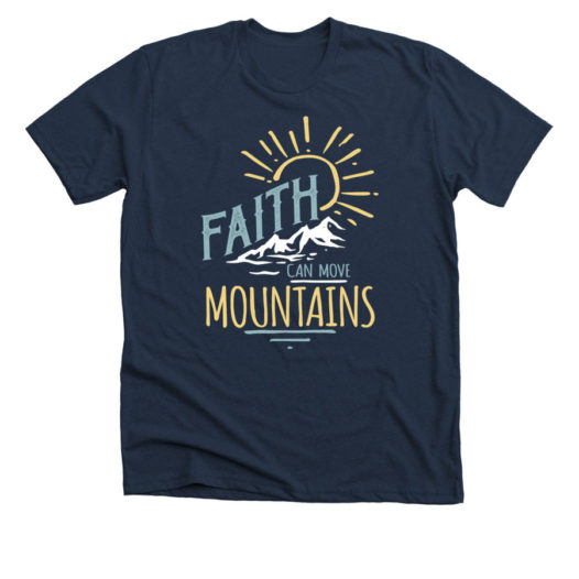
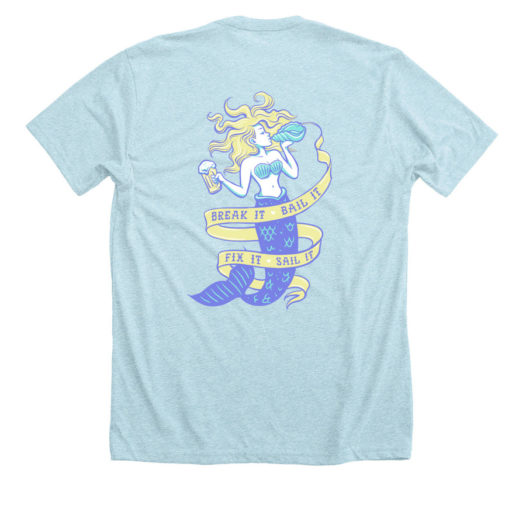
Blue + Blue
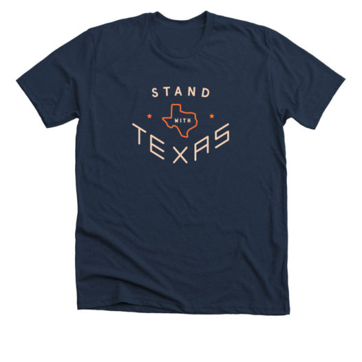
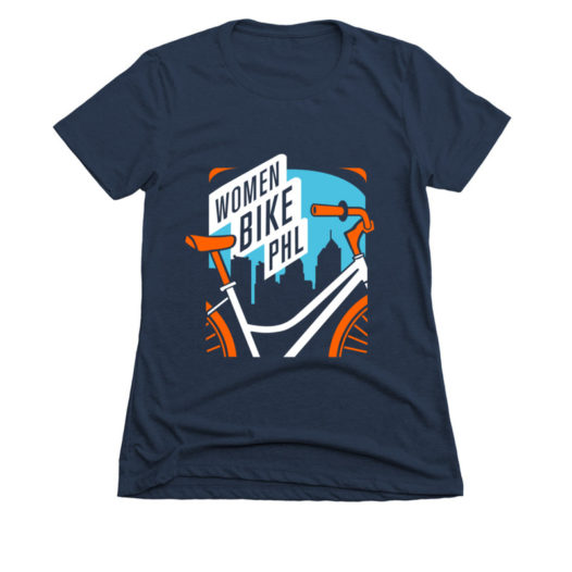
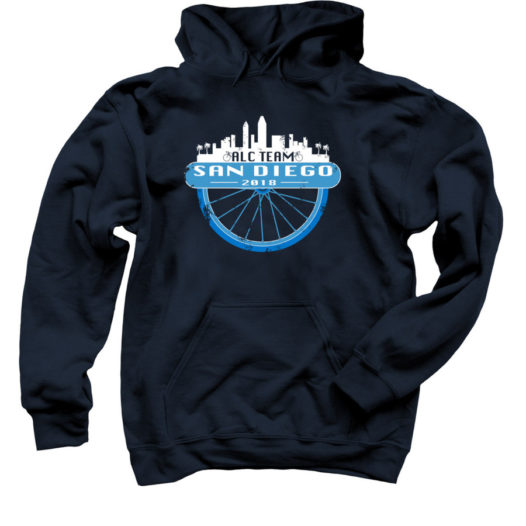
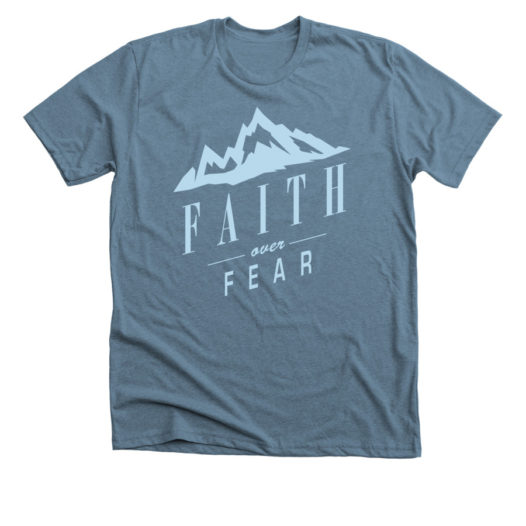
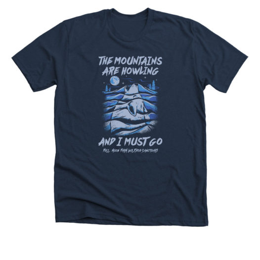
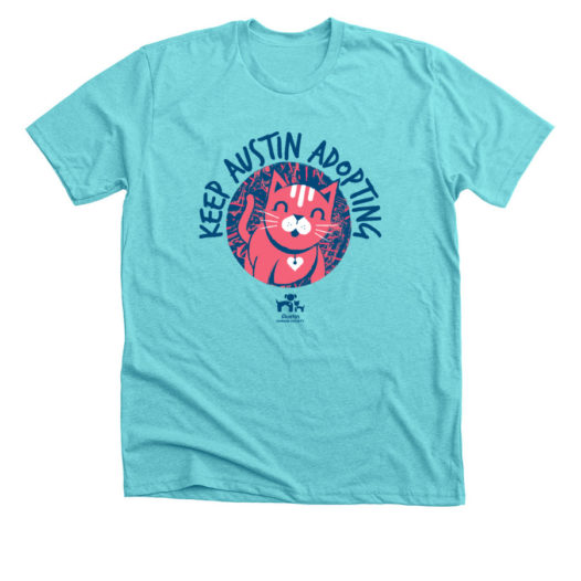
Blue ink on Blue shirts always ends up looking super great together. Just make sure that the blues being used have enough contrast so that the entire design will be visible on the shirt. Try light blue ink on a Midnight Navy tee, or royal blue ink on an Ice Blue tee.
Red + Orange + Yellow
These warm tones, when combined, create beautiful designs that feel fun and energetic. Print a design with these desert-like tones on a similar colored apparel item, or neutral toned tee for more balance between the shirt and design. Looking for more contrast? Choose a dark blue or purple to play off the reds and yellows in your design.
Rainbow
Color is fun, so if you don’t want to limit yourself, make the most of our 8-color limit. Something to keep in mind though, the price to screenprint is calculated on a per-color basis. So, we suggest keeping your color count down if you’re using shirt sales to fundraise in order to make maximum profits. But you can still have fun with all the colors of the rainbow, even if you only use 4 or 5 colors.
Neutrals
Earthy Neutrals inspired by the colors of the land, sea, and sand combine so well together. If your design features images of nature, using a palate of earth tones carries on the message and tone of the shirt. Our Light Olive and Stone Grey both serve as fantastic backdrops for your neutral design.
Brights
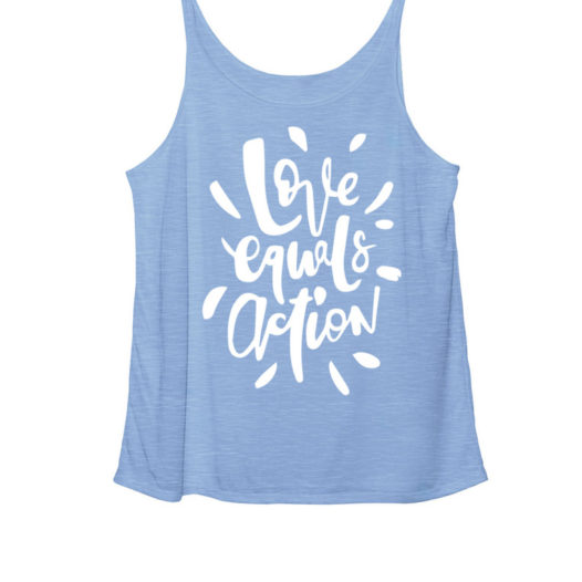
Neon inks and bright shirt color combinations might not be right for all campaigns and causes, but going bright is a great way to create a shirt that exudes energy and positive vibes. Tahiti Blue and Neon Green are our most vibrant Unisex Tee colors, but the True Royal and Red Triblend Slouchy tanks are super bright as well!
No matter what ink and shirt colors you’re thinking of combining, make sure that there’s high contrast between the color of the apparel and the design being printed on the shirt.
Thanks for taking the time to read this post. We’d love to hear from you! Please leave a comment below and let us know your experiences with t-shirt design software.
Pin this post for later! 
