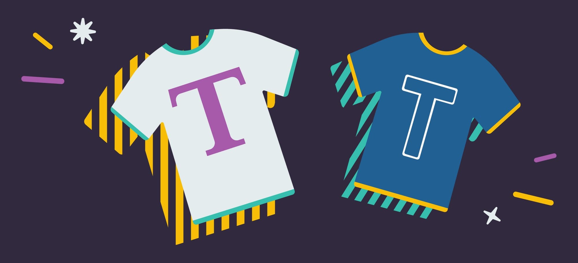
How to Choose the Best Fonts for T-Shirt Designs

Great designs sell t-shirts. There’s nothing outrageous about that statement – we all know it’s true. In the world of design, less is usually more. Minimalistic designs can pack more punch than overly intricate ones.
Well, it’s hard to get more minimalistic than the text-only design. But “minimalistic” doesn’t mean easier. In fact, when you have fewer elements to play with, you have to get the most out of what you do have. For a text-only design, we’re talking about words and typefaces- or fonts, if you prefer.
The art of using text is called “typography” and this post will discuss how to choose the best font for your t-shirt designs.
What is Typography?
LET’S BREAK IT DOWN:
Typography: The art of using text (Example: Different combinations of typefaces & fonts).
Typeface: The overall appearance and aesthetic of text (Example: Times New Roman).
Font: A typeface meeting particular size, weight & treatment requirements (Example: Times New Roman, Bold, Italicized, 12 pt).
If you’re new to the design industry, you probably think that there isn’t much to typography. Most of us have played around in Microsoft Word or some similar application at some point where all you have to do is highlight some text and pick a font that looks nice from the list. How hard could it be?
In reality, typography is a pretty deep subject. Design students study it in great depth, and some people make a lifetime’s work out of it. Just like fine art, there are differing schools of thought, trends and styles, however, that doesn’t mean you have to dedicate years of your life to study it before you can make great designs. You’ll just need to do a little research and play around with different fonts, pairings and arrangements until you get more experience. To learn more about font pairing, check out this article from Design for Founders.
Good Typography Versus Bad Typography
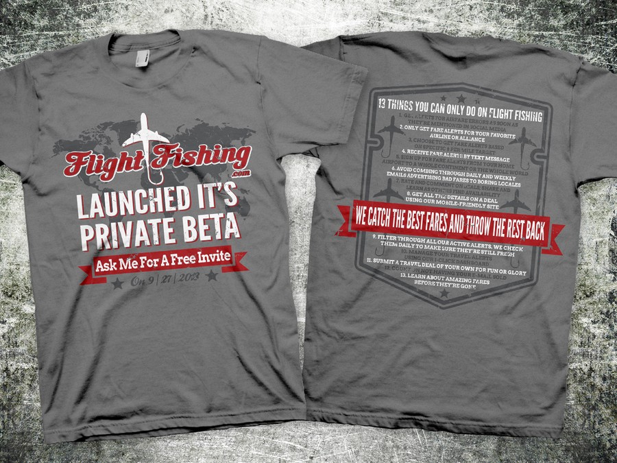
As a casual observer, you recognize bad typography when you see it. It just looks wrong. Recognizing good typography is a little harder, because, when it works, you hardly notice it. Instead, you get the full emotional impact of the design. It may sound a little out-there to say typography has an “emotional impact,” but it’s true! A simple choice of font can make a huge difference to the feel of the text. For example:
See what we mean?
Picking the right typeface takes more work than you would imagine – at first. Of course, when you start working on your own designs, you quickly recognize when it isn’t working. It can be really frustrating to stare at a computer screen, wondering why it just doesn’t look right. Most likely, your design is missing emotional impact. A huge part of getting that emotional impact is choosing the right font. Each font creates a different feeling in the observer.
So, What’s the Best Fonts for T-Shirt Designs?
If you’ve come here for a short list of the best fonts for t-shirt designs, I have bad news for you. There is no such thing as a “best font.” Every typeface has its time and place: they all serve to add meaning and interest to your text. Each font is appropriate for a certain use. Many designers and brands have their own preferred list of “go-to” fonts, it’s a part of their house style. There are some benefits to this approach, mostly because it gives a recognizable and signature look, but it also saves time looking for new and different fonts!
However, relying on the same few fonts over and over is risky. You may rapidly find yourself falling into the trap of being too predictable. Before long, your designs will start to feel stale and the public will recognize that. Different styles come into fashion and go out of fashion all the time, so a serious designer has to be aware of the trends, but they also have to keep exploring new styles to avoid getting stale.
In fact, every new design project has its own requirements and deserves to stand on its own. Even if the design you are working on is a part of a series. You always have to bring some fresh elements.
To stay up-to-date with typeface trends, or just to get an idea of what’s popular right now, check out these resources:
Typewolf Recommendations: Font Recommendation Top 10 List for 2017
Graphic Design Junction: 50 Best Free Fonts for 2017
IM Creator: Free Fresh Fonts 2017
The Design Range: 10 of the Most Prominent Typography Trends in 2017
How to Choose the Right Font for Your Design
Choosing the right font for your design takes some exploration.
First, you have to explore the message you’re trying to get across. You have to grasp more than the words you are trying to convey. What is the emotional impact you’re looking for? What is the appropriate “voice”?
Your design has one job – to get this message and emotion across to the individual. Good designs succeed, and bad ones fail.
Only when you understand what you are trying to achieve can you choose an appropriate font. Luckily, you don’t have to know the complete history of each font to work out if it’s right for your design, you can use your own judgment and taste. Of course, judgment and taste are skills and just like any other skill, they improve with practice.
The best way to develop your taste and judgment for fonts is to experiment with different choices. Choosing a font is just one part of the design process, you’ll still have to experiment with different combinations, layouts and pairings. Computers make it very easy to try out thousands of different variations quickly. You can drag your text around, change the layout, scale it up and down, and change the font. Keep experimenting, and save each variation you like.
Design a few options and then come back later and review them with fresh eyes. You’ll be able to see more clearly which ones work and which don’t when you step away and forget about them for a bit. Combining fonts is a very powerful way to strengthen your message, but remember – a little goes a long way. Combining too many fonts in a single design is a great recipe for confusion. Good designs are not confusing. They may appear chaotic, but there is always a method behind the madness. Your task is to find the right balance that works with the message you’re trying to convey.
Where to Get Fonts
Don’t limit yourself to the fonts that are already installed on your computer. These fonts are usually very general, recognizable and not tailored to represent a specific meaning or style. For your t-shirt designs, you’d be better off exploring font directories for typefaces that really represent your brand and your message. Here are some that you can check out:
Creative Market Fonts (Premium): Get professional quality typeface bundles that fit your unique style.
Dafont (Free): Downloadable fonts in many different categories & themes.
Font Squirrel (Free): Huge library of downloadable free, high quality fonts.
1001 Free Fonts (Free): Huge library of fonts in different categories.
Adobe Typekit (Free & Premium): Marketplace of fonts for designers.
Behance Free Fonts (Free): Assorted library of free fonts.
Font Fabric (Free & Premium): High quality fonts for designers.
Font Library (Free): Catalogue of free fonts.
Google Fonts (Free): Directory of free designer fonts.
The League of Moveable Type (Free): High quality & free fonts.
Lost Type (Free & Premium): A library of unique typefaces.
MyFonts (Premium): Huge library of professional quality fonts.
What the Font (Free): Useful tool to help you find specific fonts by uploading an image.
Some fonts are free, and others are licensed. That means you have to pay a fee to use them. Fortunately, there are some amazing free fonts out there, so you can still get high quality fonts on a budget.
A word of advice: come up with several designs for your t-shirt with different fonts before you make a final decision. You should at least make 2 different “mockups” – but more is better.
Validating Your Font Choices
Developing your own taste and judgment is an important part of being a designer, but you should never limit yourself to your own viewpoint. For a design to succeed, it has to create the same emotional impact on other people too, that’s why it’s advised to always get a second opinion from someone you trust. Try to pick someone reliable, you don’t want opinions from someone who will shoot down every idea you dream up, and you don’t want a “yes man” who will praise every single design no matter what they look like. Pick someone with good taste and if they’re a part of your target audience, that’s even better.
Conclusion
We’ve only just scratched the surface of typography, and typography is just one small (but important) part of the t-shirt design puzzle. If you’re not sure where to start, just begin by experimenting with typefaces and font pairings to develop your taste and judgment. No amount of reading will ever take the place of personal experience. If you’re interested in learning more about how to actually start building your own t-shirt line another other types of clothing, check out this post on how to start your own clothing line.
When you’re happy with your results, then you can start learning more about the technicalities of design. As your taste develops, check out the work of other designers. Get inspired by them and work out how they use the power of font to enhance their designs.
Thanks for taking the time to read this post. We’d love to hear from you! Please leave a comment below and let us know your experiences with t-shirt design software.
Pin this post for later! 

