Using Fonts Effectively In Your T-Shirt Designs (Plus 10 Free Font Downloads)

T-shirt design can accomplish a lot of things. Ideally, your t-shirt should represent your brand well, look fantastic, and clearly communicate a message that makes the wearer proud. When aiming to create a t-shirt design with all of these elements, there is perhaps nothing more important than choosing the perfect typeface(s). Check out our guide to effectively using fonts in your t-shirt designs, plus 10 free font downloads.
Why Choosing The Right Font Is Worth The Time
Unless your around fonts a lot, spending time sifting through all of them to find the right one can be tedious and monotonous. However, it’s absolutely worth it to do, because even the most subtle differences in font can make a world’s difference.
Steve Jobs, founder of Apple, didn’t underestimate the importance of fonts in design. After dropping out from college, he decided to take a class in typography, which he credited with playing a major role in Apple’s success. Jobs on that class: “If I had never dropped in on that single course in college, the Mac would have never had multiple typefaces or proportionally spaced fonts.”
The Importance of Type and Design is also what causes Apple to pour tons of resources and an in-house design team into creating a new custom typeface, San Francisco, to replace the incredibly similar one they used prior, Helvetica Neue.
The takeaway: this stuff matters.
How to Choose a Font: Types, And What They’re Good For
Choosing a typeface is like any other art form; there are best practices and suggestions to follow, but ultimately, it can come down to personal preference. That being said, following some suggestions can help you arrive at your perfect typeface a lot faster. So lets cover the four basic types of fonts, and what each one is good for.
Types of Fonts
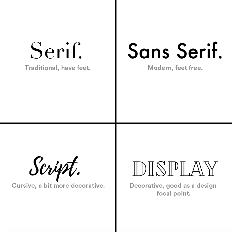 The graphic above shows the four biggest font types: Serif, Sans Serif, Script, and Display (or Decorative). The top two, Serif and Sans Serif, are both commonly used for smaller text in a design because they’re very legible, but not all that exciting. Script and Display fonts, however, typically serve best as the focal point of a t-shirt design. Since they’re unique and exciting, these are often the elements you want to design around.
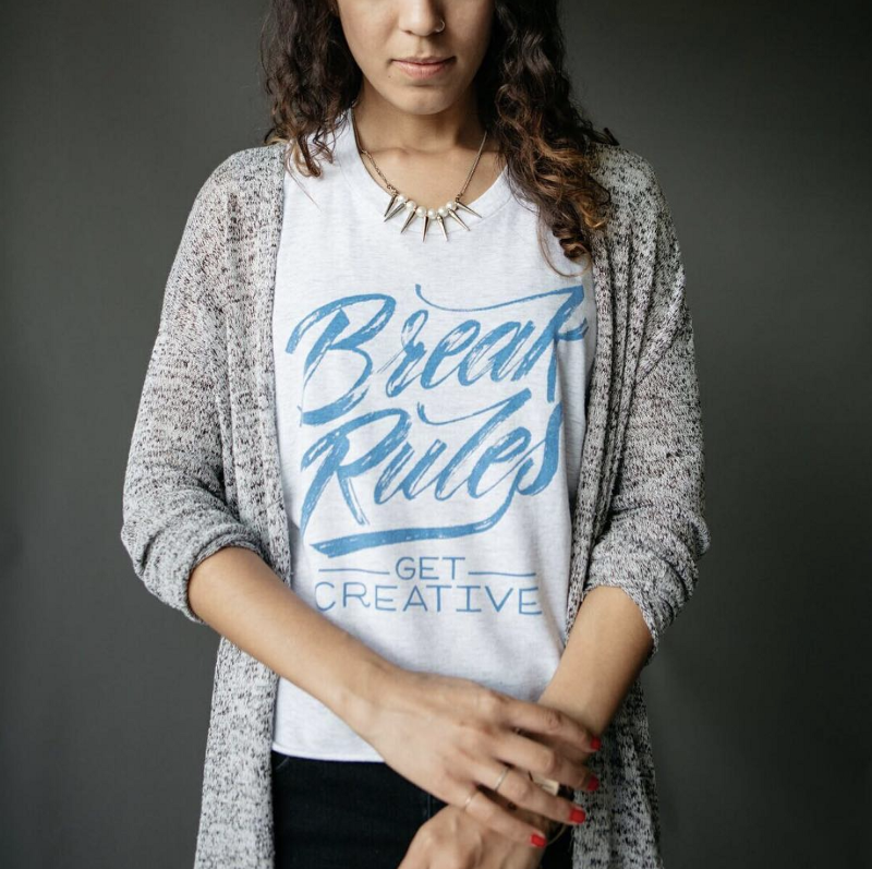
The shirt above is a great example. The focal point of the t-shirt design is this really cool custom script typeface with some neat texturing, supplemented nicely with an easy-to-read font below. Ironically, this shirt follows all of the rules.
Like we said earlier though (and is reiterated by the design above), rules are made to be broken, and when broken in the right context, can create something really special.

We mentioned that Script and Display fonts are best as focal points, while Serif and Sans Serif are best for support text. The t-shirt above smashes that rule though. It’s a Sans Serif font in black, on a white t-shirt — couldn’t sound more boring. However, it looks great! The straightforward message paired with the no-nonsense feel of this design makes it work really well. So, don’t be afraid to break rules where you see it fit.
How to Choose Your Font
Once you know the main font types and what they’re good for, choosing one for your design will be a lot easier. Asking these three questions will help you narrow down your font options.
- Who am I designing for?
This question is important to ask in just about everything you do, and holds true when designing t-shirts, too. If you’re the marketing department of a tech company, odds are you’ll want to use a nice, clean Sans Serif font. Or, if you make motorcycle inspired clothing brand, you may want to stay clear of curly or bubbly script fonts, and opt for something a bit more rugged. - What message am I trying to get across?
It may sound silly, and maybe a bit subjective, but different fonts are going to feel differently to people, and feeling can be really important. Do you want your t-shirt design to have a warm, friendly feel? Or something a little more bold and straightforward? - What matters more: looks or readability?
This is an important question, as it should have a very heavy influence on the visual elements of your design. If getting your message across loud and clear is of the upmost importance, you’ll want to go with a font that is easy to read. However, if the design itself is more important than the actual words, then choosing a decorative display font might be the way to go.
10 Great Fonts, and Where To Download Them
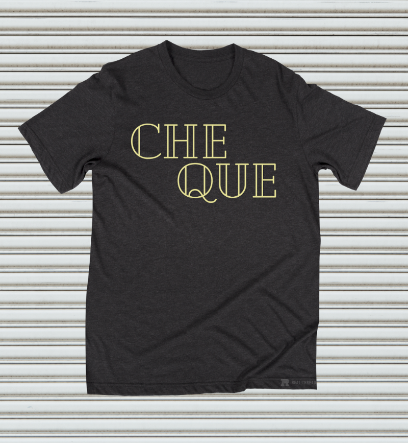
Fonts used to be pretty hard to come by, but nowadays they’re so easy to find that the volume of choices makes it overwhelming. So, we decided to sift through for you and pluck out 10 of our favorite free fonts for t-shirt design, including the link to download them (click the font name to download).Cheque: Display
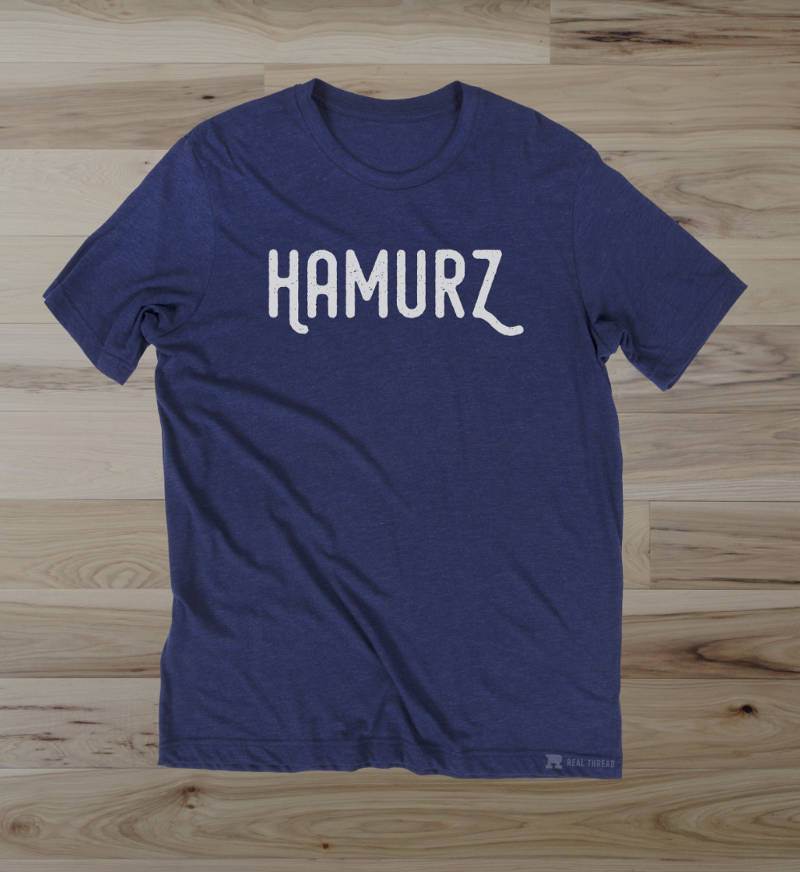
Hamurz: Display
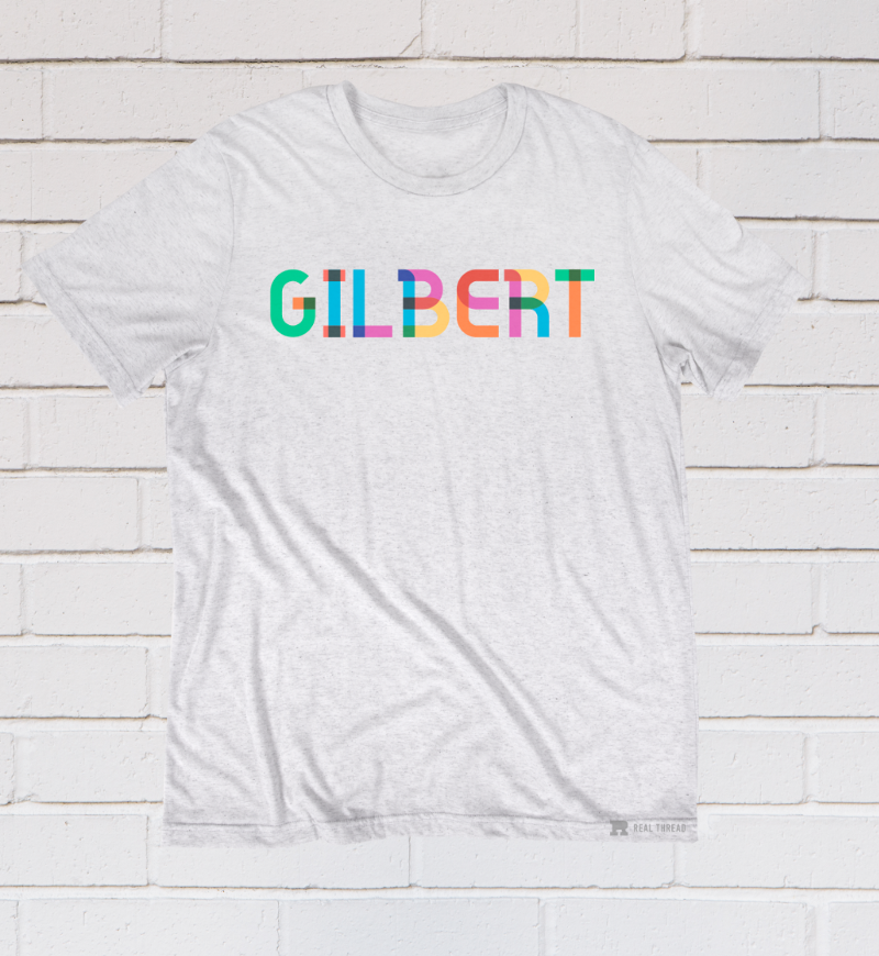
Gilbert: Display
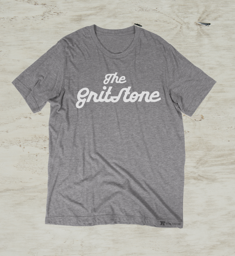
Gritstone: Script
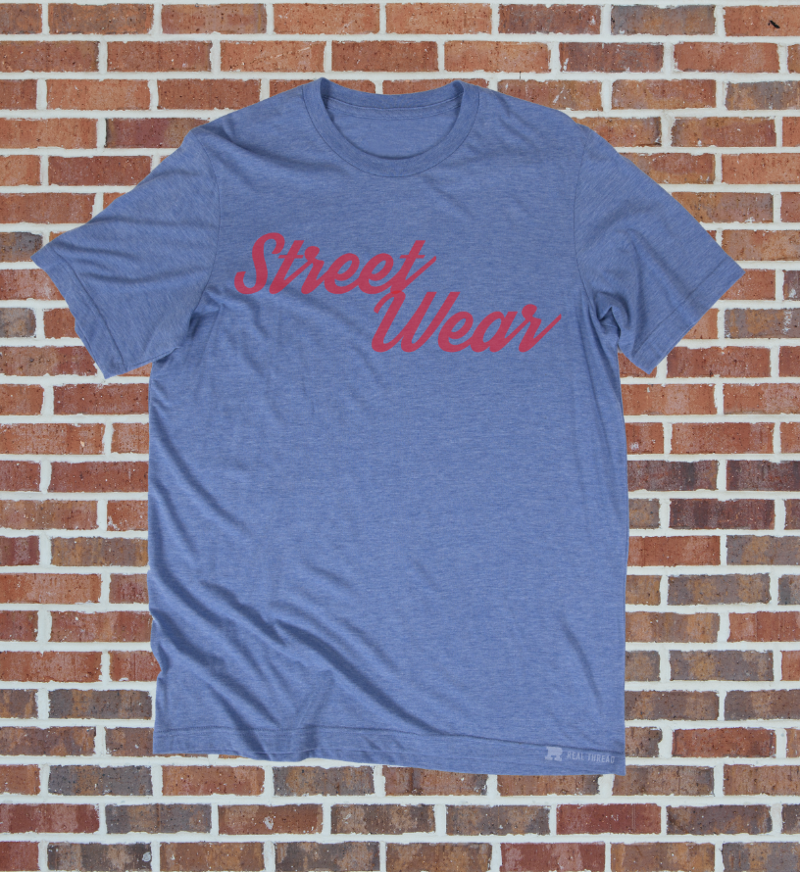
Streetwear: Script
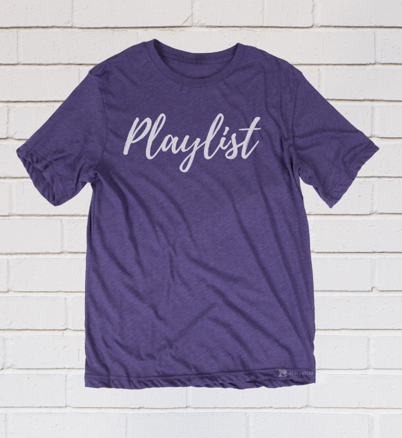
Playlist: Script
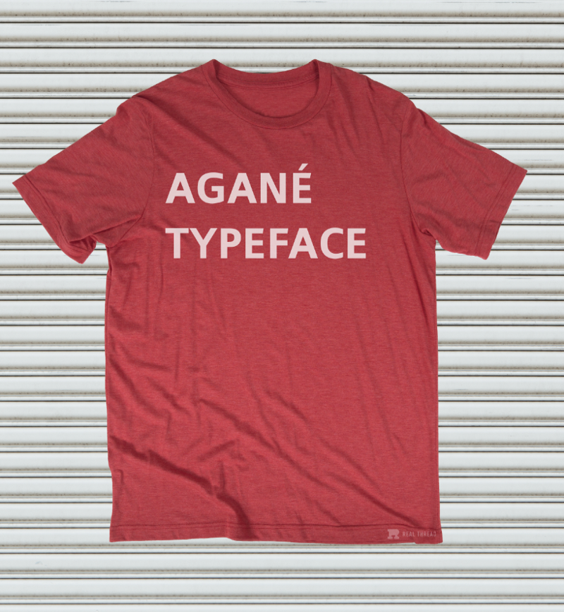
Agané: Sans Serif
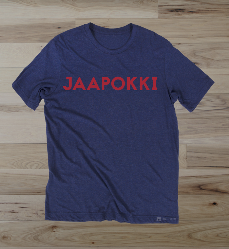
Jaapokki: Serif
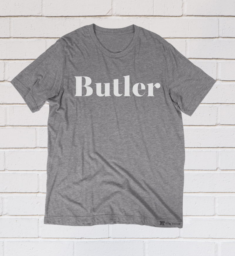
Butler: Serif
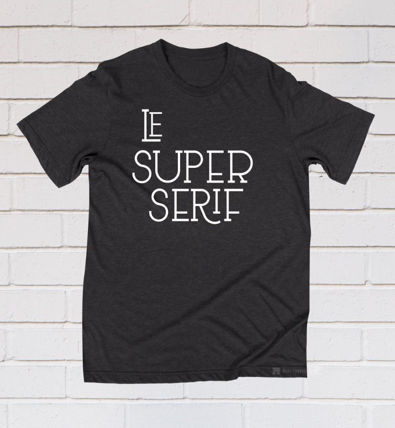
Le Super Serif: Serif
Thanks for taking the time to read this post. We’d love to hear from you! Please leave a comment below and let us know your experiences with t-shirt design software.
Pin this post for later! 
